


Emirates NBD
Rebrand of merging UAE banks, Emirates Bank and National Bank of Dubai, into the largest bank in the Middle East.
Duration 3 years

This is a branding & design guidelines project I was involved in pre-UX design, but is still relevant as many of the skills are essential in both disciplines.
The challenge
A top to tail branding of merging UAE banks, Emirates Bank and National Bank of Dubai, into the largest bank in the Middle East with visibility across the world markets.
The result
Following the launch, Emirates NBD was voted number one banking brand in the Middle East by The Banker magazine and in the space of two short years was the largest financial services provider in the UAE – worth an estimated $36 billion. More recently, Emirates NBD won Asia’s Best Brand at the latest CMO Asia Awards for Excellence in Branding and Marketing. Competing against entries from 25 countries in the Middle East, Asia and Asia-Pacific, Emirates NBD was the only bank from the UAE to win an award at the event.
Key responsibilities
Creative, critical & strategic thinking/Logo/Branding/Art direction/Design/Team leadership/Time management/Client liason

The story
The team was chosen because of its combined experience working on similar finance-based brand development projects and the ability to be agile, flexible and reactive. Over the next two years, this proved to be an essential ingredient that allowed us to overcome the cultural business challenges and keep the project moving forward while we worked to shape the new entity.
As Director/Partner I played a pivotal role in strategic design and branding initiatives, specialising in transforming client visions into impactful visual realities. The massive rebranding initiative for the merged Emirates Bank and National Bank of Dubai, creating what became the largest bank in the Middle East, Emirates NBD.
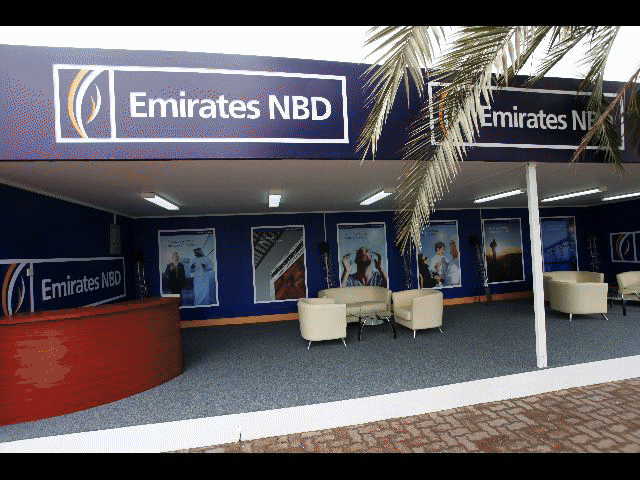
My responsibility extended beyond aesthetics, acting directly on focus group data, client briefs, and strategic value goals and again on user testing data. I was instrumental in conceiving, designing and delivering a cohesive brand identity across multiple locations and international markets whilst in continuous contact with the client. This comprehensive rollout included the branding & brand guidelines, above-the-line advertising campaigns, press, website & online ads and an extensive range of print deliverables (brochures, leaflets, posters, POS, and correlating image libraries), as well as credit cards and environmental signage. The list was huge and involved a thorough audit of each bank's existing collateral, rationalisation and alignment with their respective business strategies.
Crucially, this involved not only developing a brand, but a multi-lingual brand system (English and Arabic) meticulously designing distinct yet harmonised visual look-and-feels for several tiers of banking products. This complex challenge required deep consideration of diverse user segments and their unique needs, ensuring each product family was easily distinguishable while residing cohesively under the overarching Emirates NBD brand umbrella. My work here directly informed intuitive visual navigation and reinforced brand clarity for a vast and diverse user base.
The project was very interesting as the banks aim was to emulate the financial structure found in Singapore, which is traditionally seen as where 'East meets West'. They were keen to move away from traditional Middle Eastern branding and get a more international Western look and feel. Having had plenty of experience in branding design over the years it was a great learning curve to work with clients in UAE that had different philosophies, culture and traditions.
Whilst we were getting an education in the Arabic world and how things worked, we in turn were teaching them how the western world sees institutions and how they portray their brands. It was clear that there would have to be a solution that took both sets of cultures and philosophies into account when producing a worldwide brand with its roots firmly set in the middle east.

Their were strong allegiances to both the banks that were merging and the board was made up from members of both of the old institutions. It was a logical starting to point to take elements from both previous identities and forge them into a newer modern looking brand whilst keeping some legacy. This is what formed the 'unity' logo.
Elements of the globe from the Emirates bank logo and the wind in the sails from the dow logo of NBD with conflicting angles representing the different flows of east and west meeting together. These were tweaked to give a more organic feel of motion representing the push and pull of both cultures.
When it came to colours the client insisted on using green in the logo, traditionally in the east, green represents Islamic banking & the client and users were keen to use it. It took user testing, focus groups and our advice to determine that if it was a 'world' bank, other colours could be used which would not have localised recognition and still be acceptable. In fact, this was key to give the brand an international and modern flavour.
We chose:
Yellow – Optimism & Clarity
Blue – Trust, Strength & Dependability
White – Truth & Transprency

These colours ran through the master brand giving it a bright, fresh and colourful look and feel. We created corresponding imagery styles to match this energetic brand.

Retaining the master brand and tweaking colours to represent what we and users felt best represented the sub brands we created a look and feel for Priority Banking. This included a different more refined look which alluded to the feeling of quality, wealth and importance, and ran through all the image libraries and assets alike.

This was also true of how we created the look and feel for Private Banking – a more exclusive sub category yet. The platinum theme ran through all the collateral and again the image library. Great care was taken to when choosing the imagery before treating it to make sure it visually represented the genre.

“The Emirates NBD brand is truly groundbreaking, and the first corporate identity project of its kind in the Middle East. Being recognised as the most valuable banking brand in the region is a remarkable milestone. It will undoubtedly increase our shareholder value and open up the path to success in international markets: exactly where we want to be.”
Rick Pudner
CEO, Emirates NBD
Iteration
After the main logo had been signed off we went through the various stages of designing the large amount of brand collateral. This was a very fluid process with us presenting ideas and taking feedback from the client as to how and why they should look a certain way. With both sides presenting their cases and reasoning behind the designs we worked together to find solutions that made the client happy, served their customers and still pushed the branding onto a world level.
The conclusion
After nearly three years and a lot of hard work and iterations a complete Brand Book was delivered in which all assets were covered. Above-the-line advertising campaigns, press, website & online ads and an extensive range of print deliverables (brochures, leaflets, posters, POS, banking forms and correlating image libraries), as well as credit cards, environmental signage and vehicles. How every asset should be set up and the guidelines for how to keep them within the brand rules when being tweaked, updated or used create new assets.
What I learned
I learned that no matter how well versed you think you are in branding & visual style sometimes there are valid client reasons why things cannot look or be designed in a certain way. But with creative and critical thinking and a bit of problem solving there shouldn't be any road blocks you can't get around. Sometimes you have to think on your feet and come up with solutions that circumnavigate the obstacle that has been thrown in your way to achieve the best product.