


Freegame
Responsive website – survey & dashboard – A mentoring product for young aspiring athletes to gain access to coaching from ex-professional athletes in their chosen field

Duration Oct 2025
My roles were as follows: Branding, UI & UX design and research
Key responsibilities
Concept/Logo/Brand & Brand Guidleines
Paper & digital wireframing
Design/Prototyping (lo-fi & hi-fi)
Testing & Iteration
The challenge
Young promising athletes suffer from a lack of knowledge when it comes to furthering their career. Not only skill development but also mental wellness, career & financial planning and contingency planning.
The solution
To make a responsive website that encourages users to take on professional mentoring from players who have played professionally – for player, by players – assessment, alignment, activation, acceleration.
Empathise
Interviews with athletic teens and their parents were turned into empathy maps to better understand and target the users needs. I transitioned this data into personas representing the larger group. This was used to make journey maps and discover where pain points were arising and what the cause was.
Define
The discovery was that whilst they may be talented athletes, they had little or limited or no knowledge of how to proceed with trying to transition to colleges or from colleges to professional teams and what it entailed. The product was also concerned with wellbeing, mental preparation, financial awareness and contingency planning.
Pain points we discovered were:
-
Talented young athletes had no formal plan to follow.
-
Talented young athletes had no contacts on which to rely.
-
Talented young athletes felt vulnerable as they had no experience in furthering their potential & career.
-
They had very ittle knopwledge on how to build their personal brand.
-
Parents helping felt overwhelmed and out of their comfort zone (how to know if offers or contracts were good and where to find).
-
Talented young athletes and their parents were not sure how to plan for contingency should there be problems.
The empathy maps and in turn personas meant I could then formulate a problem statement:
Janeen is a talented young athlete who needs to further her potential career because she wants to become a professional sports person.
Once I knew what I wanted to achieve I made a goal statement and carried out a competitive audit on similar products/websites.
"Our app and responsive website will let users be mentored by experienced ex-pro players which will affect them by giving them the knowledge and guidance to make the right decisions."
"We will measure effectiveness by the amount of users who sign up and use the service."
I made a list of criteria that would be useful to have in the app:
-
Easy to set up user profile & account
-
Modern & fresh design
-
A profile that shows athlete stats
-
A profile that includes a media section
-
Timers & reminders to carry out certain activities
-
Easily accessible information to guide and help users
-
Contact button for prospective scouts
Ideation
Once I knew what I wanted to achieve I started by listing what pages I'd need and roughly what would need to be on each page. I laid out an information and started on my paper wireframes.
Prototypying
Once I was satisfied I made low fidelity digital wireframes in Figma and turned them into prototypes with components for testing.


Testing
I then usability tested the Lo-fi prototype and with the results to created affinity diagrams, which in turn gave the data to create insights and prioritise them. I could then iterate the design before making Hi-Fi mockups and prototypes.
User testing came back with some useful insights:
-
All liked the way imagery engaged with them and set the scene
-
Some said there were too many questions and a lot of copy
-
All preferred the version which contained more imagery & video
-
All preferred options which showed stats as info graphics rathe than copy
-
All found the experience intuitive but would like to be able to revisit questions
if they feel they answered incorrectly.

Look & Feel
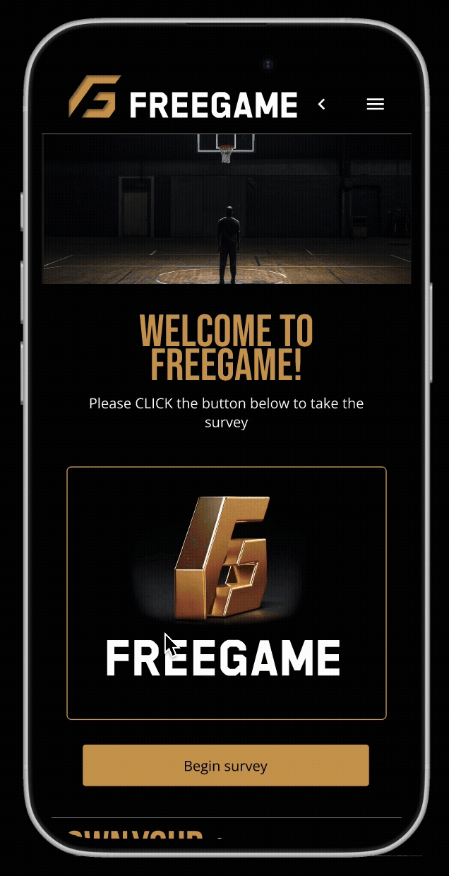
When developing the name of a product, I like the ‘does what it says on the tin’ approach. The product is the about the persoonal and professional development of young athletes both mentally and physically and future proofing them. It is all about achievement and being the best. About winning gold!
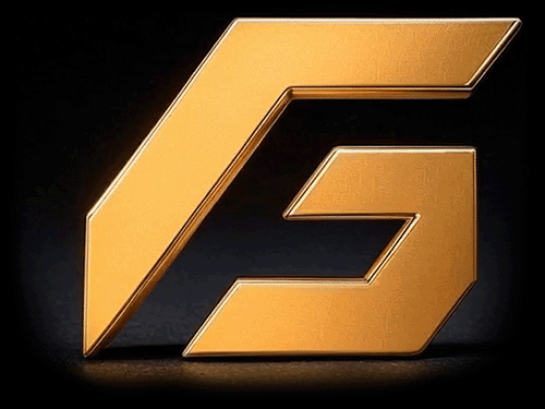
Hence the logo would have to be gold to represent the prize, it needed to be slick and have a feel of movement (like the F1 logo) as spoet is all about dynamism and movement.
Size and shape of the logo was paramount as it would have to work primarily in the tight space an app to could afford to give it.
The secondary asset for when space is allowed – is a a digital representation of the logo was made in 3D and animated to give the feeling of a gold trophy spinning representing the win.
The main font represented the names on the traditional back of shirt naming look and feel.
I wanted to have a techy up to date look and feel, yet with an influence of retro gamer to capture the essence on "teenagedom".


Iteration & Hi-Fi Prototyping
After making the Hi-Fi prototypes I user tested them again and incorporated the data from the second round of user testing. This enabled me again to prioritise insights and action them, it made for a happier user journey.


Conclusion – What I learned:
I learned that in UX the products HAVE to be user centric. What the users ‘real’ needs are is ALWAYS the most important thing to focus on. This affects the design from the start to finish and is of utmost importance to deliver a successful product. The other thing I learnt is that there is no end of twists and turns in the river in so much as what you are expecting to find out is not necessarily what you do find out, leading to unexpected and interesting insights and solutions.
Users need a simple and intuitive dashboard that they can interact with whether it be the athlete themselves, their mentor or prospective employers, contract managers or scouts.
It is vital to show the information that accounts for all of the aboves' the various needs. If it is simple and

What next:
-
If athletes wanted to advertise and show their skills, linking their profiles to socials may be a feature that would get exposure.
-
For users that get really into exercising there could be an option to set up an recurring exercise program.
This would be like a gym workout. -
An option for music to play whilst users are exercising enabling exercise playlists to help with motivation.
-
The option to connect heart rate monitor so calorie counting and exercise time would be visible.
-
Scheduled classes to join remotely for those who struggle to get themselves moving. Commitment to something bigger could motivate them and make them feel part of a group.
