


Hangout – Responsive website – A safe platform for teenagers


The challenge
With more and more crime, teenagers need a safe places to hang out with their friends and enjoy their favourite activities as well as trying various new activities. Time with their friends is precious.
The solution
To make a responsive website where teenagers can log in, chat with their friends, browse, view and organise to go to events in a safe place and keep their parents informed as to what is happening.
Empathise
I conducted user interviews, which I then turned into empathy maps to better understand the target user’s needs. I discovered that for teenagers time with their friends ‘hanging out’ is very important. They need somewhere to organise these meet ups in a safe environment and need to keep their parents informed as to what is going on. I also learnt that although the users have their favourite activities they were also open to trying more varied activities. I transitioned this data into personas representing the larger group and used this data to make a user journey map and discover where pain points were arising and what the cause was.

Duration March – April 2025
My roles were as follows: Concept & branding, UI & UX research and design
Key responsibilities:
Concept/Logo/Branding
User research interviews
Paper & digital wireframing
Design/Prototyping (lo-fi & hi-fi)
Testing & Iteration

Define
Four main pain points we discovered were:
-
Finding one place where all activities can be booked.
-
Having communication in the same place to avoid lots of other apps. Message usage & keeping messages in one place for reference.
-
Having a place that has activities which are in a safe and supervised environment.
-
Parents get frustrated as they don’t know where their children are or what they’re doing nor with who.
The empathy maps and in turn personas meant I could then formulate a problem statement:
Joseph is a teenage school student who needs to socialise with friends in a safe environment whilst also trying new activities in different places because they love spending time together.
Once I knew what I wanted to achieve I made a goal statement and carried out a competitive audit on similar products/websites.
"Our responsive website “Hangout” will let users chat with their friends and organise to go to events which will affect teenagers by giving them a safe place to socialise .
We will measure effectiveness by the amount of “Hangouts” booked.
I made a list of criteria that would be useful to have in the app:
-
Easy to set up user profile & account
-
Cool design – for non tech savvy users
-
Time saving options include saved hangouts, favourite hangouts,
popular hangouts & recent hangouts -
Easy search to find specific requests
-
Hangout details/description so people can see it matches what
they are looking for -
Keeps teens off larger social media platforms where they are
more vulnerable -
Easy to Book activities – can even group book
-
Easy online payment
-
Account history for transaction reference
-
Eco friendly as saves on printed promotion
-
Eco friendly as e-ticket no extra carbon footprint as no
postage & delivery -
Creates sense of community for teens, great opportunity
to meet others
Ideation
Once I knew what I wanted to achieve I started by listing what pages I'd need and roughly what would need to be on each page. I laid out an information architecture sitemap and from there started on my paper wireframes.

Once I was satisfied I made low fidelity digital wireframes in Figma and turned them into Lo-Fi prototypes for testing.

I then usability tested the Lo-fi prototype and with the results to created affinity diagrams, which gave the data to create insights and prioritise them. I could then iterate the design before making Hi-fi mockups and prototypes.

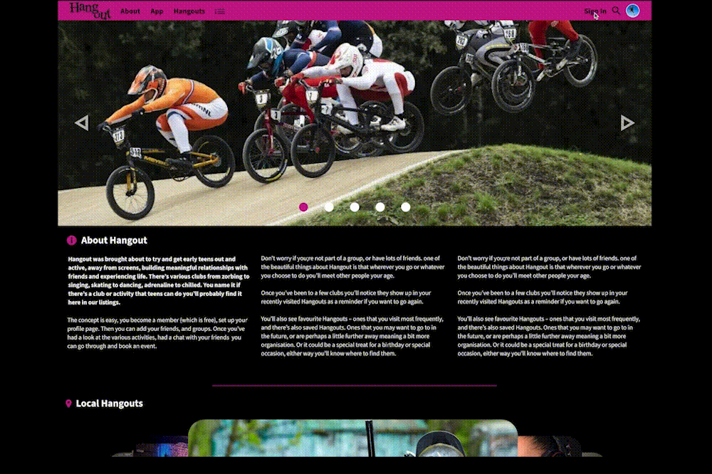
I needed the look and feel. When developing the name of a product, I like the ‘does what it says on the tin’ approach.
The product is the about young teenagers "Hanging out" with their friends, so it seemd logical to call the product "Hangout".
The look and feel was synonymous with teen fashion, kind of punky, emo & rebellious. This mean that the typeface would have to have a kind of destroyed, broken, sprayed or graffitied feel to it, and of course still be legible.
With the name chosen I wanted to add a bit of depth to the logo, so I decided to make the ‘out’ literally ‘hang out’ of the word hang.
Secondary assets – graffiti style emojis will be used as secondary imagery and enhance the punky rebellious look and feel whilst also giving a nod to the emojis now commonly used in ‘teen chat’ on smartphones.

Iteration
After making the Hi-Fi prototypes I user tested them again and incorporated the data from the second round of user testing. This enabled me to again prioritise insights and action them. It made for a happier user journey in so much as the features I changed, including putting in a mega menu to allow user to browse activities alphabetically. Users said that there were roadblocks when it came to paying, so changing the payment options to cards/accounts that teenagers have access to so they can book and pay without having to get their parents or use their parents cards.


Conclusion – What I learned
I learned that in UX the products HAVE to be user centric. No matter how much experience you think you have, what the users real needs are is ALWAYS the most important thing to focus on. This affects the function and in turn the design from the start to finish and is of utmost importance to deliver a successful product.
Users shared that after the iterations made the user journey was a much happier one. It made the journey easier and quicker, although there is still room to make improvements and add features that would make the user journey an even happier one.
What next
-
If the product was going to be developed it would be nice to add a wallet feature that parents could top up enabling the teenagers to pay for Hangouts that way, avoiding having to have a pre-pay card or bank account.
-
It would be great to have a function where as the confirmation of an event is sent, it also emails or texts the parents of the child so they can add the event to their calendar on their smartphone. This would avoid confusion & clashes in social diaries or at least help remedy them.
-
Although browsing by category has proved useful, it would also be good to have a map with local events shown on it (like google shopping does). It would really help people who didn’t want to travel far with seeing what options are available.
