


Skooly – Mobile phone app – School uniform resale

Duration February 2025
My roles were as follows:
Concept & branding, UI & UX research and design
Key responsibilities:
Concept/Logo/Branding
User research interviews
Paper & digital wireframing
Design/Prototyping (Lo-Fi & Hi-Fi)
Testing & Iteration
The challenge
New School clothes are expensive and they are grown out of very quickly. Parents are busy working and need to save money so trips to uniform shops are few and far between. Making new clothes is also environmentally costly.
The solution
To make an app that will enable busy parents to buy and sell second hand school uniform in order to save money and help the environment.
Empathise
I conducted user interviews with school parents, which I then turned into empathy maps to better understand the target user and their needs. I discovered that many parents are time poor and money conscious. They are also environmentally conscious. They complained that school uniforms are very expensive and children tend to grow out of them before they are worn out. I used this data to make a user journey map and discover where pain points were arising and what the cause was.


Define
Four main pain points we discovered were:
-
Having little free time means going to shops to buy new uniform is difficult.
-
School clothes are expensive, especially the specifically branded items only for that school
-
Producing new clothing uses lots of materials, chemicals & creates pollution and a carbon footprint delivering & shipping
The empathy maps and in turn personas meant I could then formulate a problem statement:
Sally is a busy parent who needs a quick and easy way to buy second hand school clothes for her children because she is time poor, money and environmentally conscious.
Once I knew what I wanted to achieve I made a goal statement and carried out a competitive audit on similar products/websites.
"Our school clothes resale app Skooly will let users buy & sell secondhand school clothes which will affect busy parents by saving them time and money.
We will measure effectiveness by the amount of items listed and sold."
I made a list of criteria that would be useful to have in the app:
-
Easy to set up user profile & account for non tech savvy & time poor users
-
Easy to use design for non tech savvy users
-
Time saving options – saved search, starred items, recent items
-
Can see items as picture – reassurance that people can see what they are buying
-
Item picture/details/description so people can see it matches what they are
looking for -
Saves money – much cheaper than buying new items from shop
-
Contributes to school & community – % of each sale goes back to school
-
Easy to receive/deliver items – can be picked up at school office or in play
ground directly with seller/buyer -
No bidding so you know the price – unlike ebay no price war. Set price so no
squabbling, saves time, people know what they are getting and for how much,
as often no time to wait for auctions and need items asap -
Easy online payment so no need for cash
-
Account history for transactions & items so you can see how much you have
spent and what bought/sold. Can see potential savings made -
Eco friendly as reusing items that may be thrown away
-
Eco friendly as no extra carbon footprint & saves money as no postage
& delivery -
Creates sense of community as more interaction by parents who wouldn’t
normally be in contact -
Creates feeling of being a part of the school & community which may lead to
closer community and positives for the school -
Remembers customers’ payment information to make their time feel valued.
Ideation
Once I knew what I wanted to achieve I started by listing what pages I'd need and roughly what would need to be on each page. I laid out an information architecture sitemap and from there started on my paper wireframes.

Prototyping
Once I was satisfied I made low fidelity digital wireframes in Figma and turned them into Lo-Fi prototypes for testing.
Testing
I then usability tested the Lo-Fi prototype and with the results created affinity diagrams, which in turn gave the data to create insights and prioritise them. I could then iterate the design before making Hi-fi mockups and prototypes.


Look and Feel
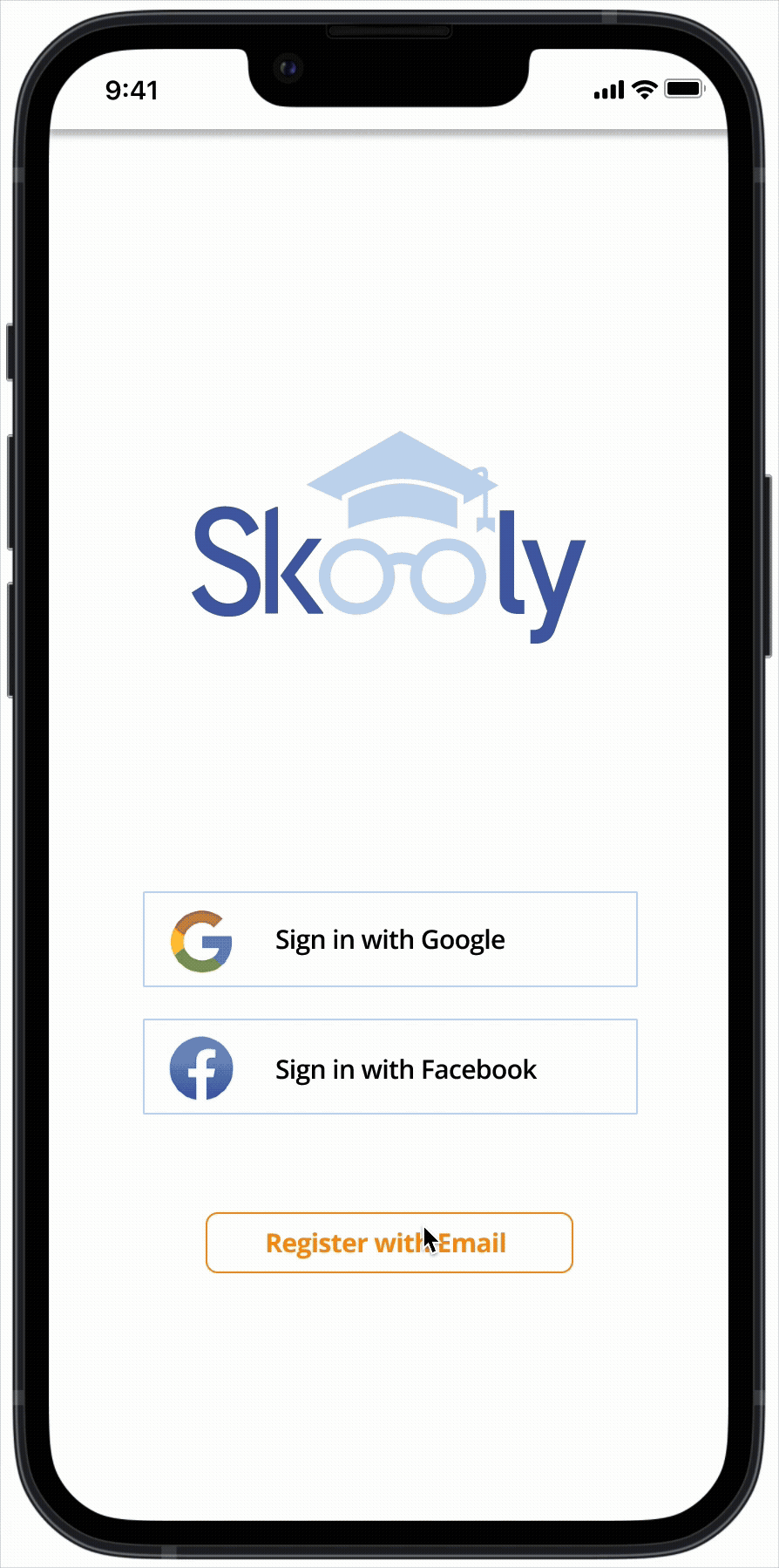
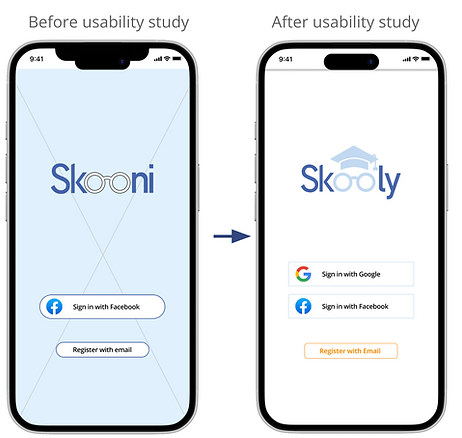
When developing the name of a product, I like it to be clear and simple. The product was about school and unifroms, so I chose Skoony as the name. However after drawing the logo up something bugged me about it, it just didn’t sit right. I think a logo should “say what it does on the tin”. After having a rethink I realised it was the name that just didn’t work. I felt it sounded too much like a nautical term – a schooner for a ship, or a drinks measure.
After revisiting I came up with “Skooly” – a term for somebody interested in or at school. It was catchy and short. This meant to logo needed a redraw. After simplifying the logo to give it more standout I felt it worked much better and would suit the target audience as well as relate much better to what the app does.
Blue represents trust and orange friendliness, so they were my key colours. They also scored well in WCAG with enough contrast for people with visual impairment to be able to see it well.
Iterations & Hi-Fi Prototyping
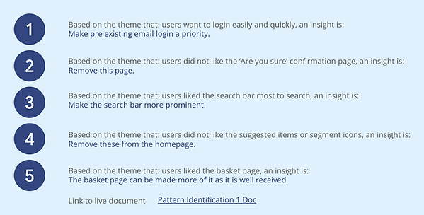
I built Hi-Fi mockups and prototypes and user tested them. Three main insights were to:
-
make loging in with a pre existing email a priority
-
make the search bar more prominent
-
de-clutter the payment page
Login priority

of users wanted logging in with a pre existing email made a priority

Search Bar priority

100% of users wanted the search
bar more prominent


De-clutter payments
Splitting the page in to two
pages solved the pain point
Testing
After making the Hi-Fi prototypes I user tested them again and incorporated the data from the second round of user testing. This enabled me to again prioritise insights and action them. It made for a happier user journey. People like to login with pre existing email accounts to save time and not have to remember more passwords. Users want easy search options. Users liked the basket page so they can see what they're buying.

Conclusion – What I learned
Users shared that after the iterations were made the user journey was a much happier one. It made things easier and quicker as well as clearer.
I learned that in UX the products HAVE to be user centric. No matter how much experience you think you have, what the users real needs are is ALWAYS the most important thing to focus on. This affects the design from the start to finish and is of utmost importance to deliver a successful product.
What next
-
If the product was to be developed it would be nice to have a chat feature. This would make communication easier and could be used as a social media hub for parents of the school and possibly even by the school itself.
-
It would be great to have a school calendar with events and alerts that would notify people of upcoming events, not just list them. That could contain a “going” or “not going’ status for example, and a payment system for school outings or discos.
-
It would also be good to resell other things pupils need at school, art supplies, calculators, study books, basically anything that helps studying. It would really help to save a lot of wastage, landfill and pollution if it took off.