


Teenskreen
App and responsive website – Physical and mental wellbeing for young teenagers

Duration April – May 2025
My roles were as follows: Concept & branding, UI & UX research and design
Key responsibilities
Concept/Logo/Branding
User research interviews
Paper & digital wireframing
Design/Prototyping (lo-fi & hi-fi)
Testing & Iteration
The challenge
Young teenagers spend more and more time on screen – this is leading to
physical and mental health issues.
The solution
To make an app with a correlating responsive website that encourages teens to
exercise and get them away from their screens whilst keeping an eye on their mental wellbeing and giving feedback to their parents.
Empathise
I conducted user interviews with younger teens and their parents, which I then turned into empathy maps to better understand and target the users needs. I transitioned this data into personas representing the larger group. I used this data to make a user journey map and discover where pain points were arising and what the cause was.


Define
I discovered that although having a phone was great in so much as parents could see where there kids were and contact or be contacted in an emergency, it also came at a price. Many children became addicted to their devices having no idea of how long they were spending on them. Face to face communication, physical activity and exercise was being pushed aside and affecting their mental health and wellbeing.
Pain points we discovered were:
-
Children on devices they had no measure of time.
-
Being on screen it meant no exercise.
-
Children were becoming addicted – constantly checking devices for contact or what was happening in their social groups.
-
Parents felt that although their children needed devices for contact, safety & entertainment, they were increasingly worried about their physical/mental health and behaviour.
The empathy maps and in turn personas meant I could then formulate a problem statement:
Alfie is a young teenage school student who needs to socialise with friends but needs to reduce screen time because his mental and physical health needs improving
Once I knew what I wanted to achieve I made a goal statement and carried out a competitive audit on similar products/websites.
"Our app and responsive website will let users chat with their friends and compete in physical events reducing their screen time and increasing physical exercise which will affect teenagers by giving them a sense of belonging, competition and improve both their mental and physical wellbeing.
We will measure effectiveness by the amount of challenges completed."
I made a list of criteria that would be useful to have in the app:
-
Easy to set up user profile & account
-
Parents can monitor activities
-
Modern & fresh design
-
Timers & reminders to do activities
-
Easy search to find specific requests
-
League to see what position you and your friends are in
-
Keeps teens off larger social media platforms where they are more vulnerable
-
Account history to see what you have completed and your times/scores
-
A way for parents to see how their kids are feeling to monitor wellbeing
-
Creates sense of community for teens
-
Reminders to switch off and be aware of time spent on app
Ideation
Once I knew what I wanted to achieve I started by listing what pages I'd need and roughly what would need to be on each page. I laid out an information architecture sitemap and from there started on my paper wireframes.

Prototypying
Once I was satisfied I made low fidelity digital wireframes in Figma and turned them into Lo-Fi prototypes for testing.

Testing
I then usability tested the Lo-fi prototype and with the results to created affinity diagrams, which in turn gave the data to create insights and prioritise them. I could then iterate the design before making Hi-Fi mockups and prototypes.


Look & Feel
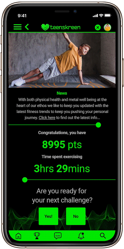
When developing the name of a product, I like the ‘does what it says on the tin’ approach. The product is the about the 'teens on screens' and all the issues associated with it both mentally and physically. I looked at a few names and finally settled on Teenskreen.
Size and shape of the logo was paramount as it would have to work primarily in the tight space an app to could afford to give it.
In the west, green is associated with health and tranquility. With the right hue and partnered with black it gives a techy modern feel.
A digital representation of a heart – a 3d pixelish heart tipping its hat to the gamer world (usually depicting health & life in games) married to the name in a lower case modern sans serif font gives the desired overall look and feel.
The secondary asset for when space is allowed – is a graphic wave representing the beating of the heart, gelling with gamer teens and adding depth to the logo and the strap line ‘Physical and mental wellbeing’.
I wanted to have a techy up to date look and feel, yet with an influence of retro gamer to capture the essence on "teenagedom".


Iteration & Hi-Fi Prototyping
After making the Hi-Fi prototypes I user tested them again and incorporated the data from the second round of user testing. This enabled me again to prioritise insights and action them, it made for a happier user journey.

Roulette wheel challenge

Everybody LOVED 'roulette wheel challenge' and prioritised making that a larger feature giving more options.
100% of users LOVED the
roulette wheel spinner


Hiding personal information
Being able to hide points, challenges and scoreboards would help certain user groups feel more relaxed about using the app. Not being judged would make them less self conscious.

80% of users appreciated why hiding private information was useful

What next:
-
I realised the product is based on the assumption that users are able bodied. This might alienate some potential users, there could be an option where you enter specific areas of the body you want to exercise. This would make it more useful for people that have disabilities and still want to exercise.
-
For users that get really into exercising there could be an option to set up an recurring exercise program.
This would be like a gym workout. -
An option for music to play whilst users are exercising enabling exercise playlists to help with motivation.
-
The option to connect heart rate monitor so calorie counting and exercise time would be visible.
-
Scheduled classes to join remotely for those who struggle to get themselves moving. Commitment to something bigger could motivate them and make them feel part of a group.
Conclusion – What I learned:
I learned that in UX the products HAVE to be user centric. What the users ‘real’ needs are is ALWAYS the most important thing to focus on. This affects the design from the start to finish and is of utmost importance to deliver a successful product. The other thing I learnt is that there is no end of twists and turns in the river in so much as what you are expecting to find out is not necessarily what you do find out, leading to unexpected and interesting insights and solutions.
Excessive screen time can negatively impact children's mental health, potentially leading to anxiety, depression, sleep disturbances and behavioural issues. Social media use can also contribute to feelings of inadequacy, cyberbullying, and reduced face-to-face social interactions. However, with mindful use and parental guidance, technology can still be a valuable tool for education and entertainment.

